ACI HEADQUARTERS | THE LAYOUT
O N E R O O M C H A L L E N G E | W E E K T W O
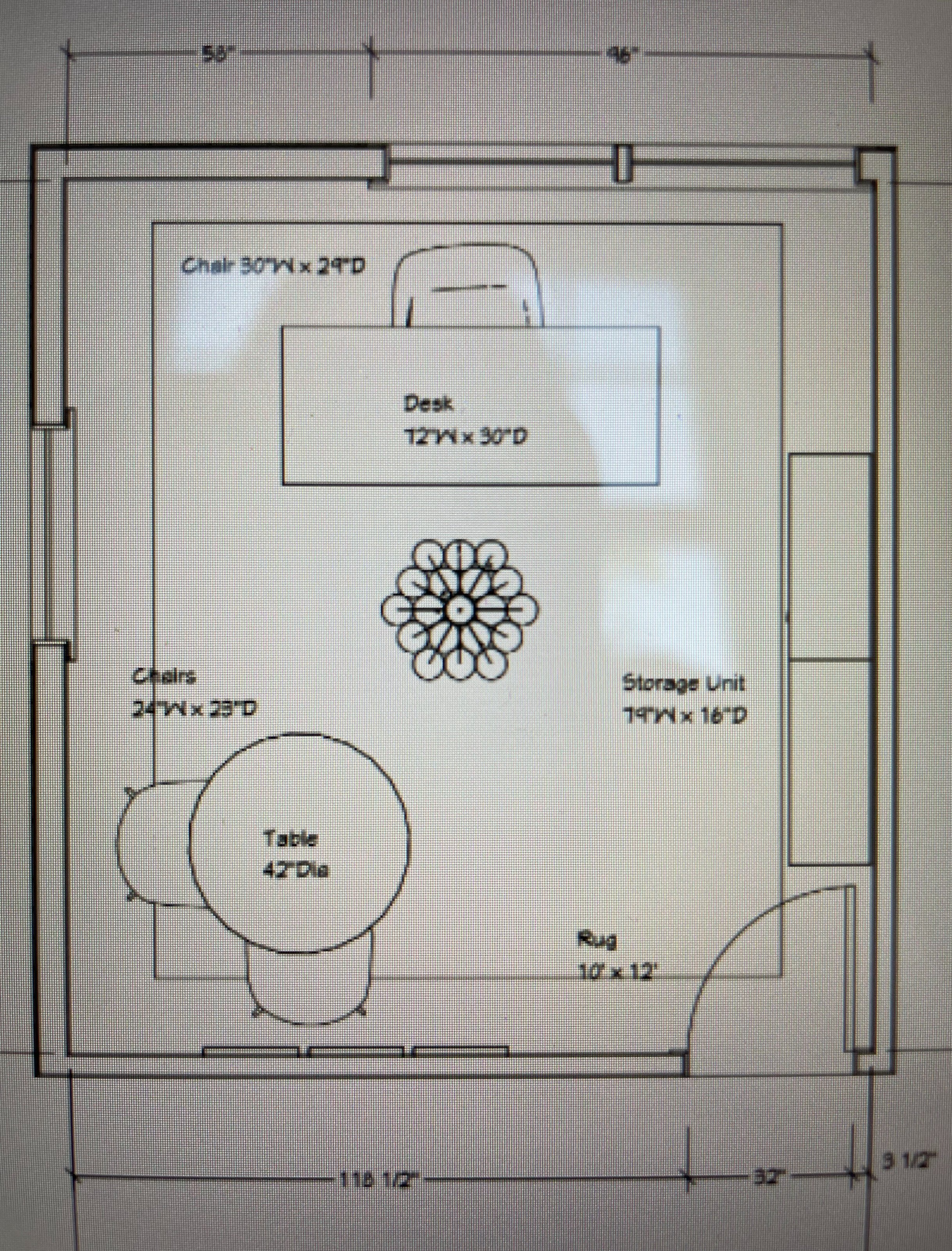
It’s week two of the One Room Challenge! Let’s talk layout, shall we?
T H E L A Y O U T
If you know me, you know I personally adore neutral tones and wanted to create a cohesive neutral space with pops of gold and darker tones from the sconces and pendant lighting, to the decor accents. It was such a huge priority to create a space that felt functional for my team and I to work together on the day-to-day, but fresh and refined take on modern bohemian design when clients walk through the doors to get a glimpse of my personal design style.
The layout is simple, functional and organized — everything we all strive for in an office design, right?
T H E S E A T I N G A R E A
Who doesn’t love a chic workspace? We found the perfect stoneware table and matching cream chairs to add texture and dimension to fit comfortably in the corner of the office. It gives just the right amount of depth and wow-factor to the space without eliminating functionality and practicality.
T H E S H E L V I N G
Something I always look for in decor is an element that elongates the space, and this free-standing white shelving unit by CB2 was exactly what I needed! Adding two to the right side of the room, it created the perfect illusion of longer walls and made space to tastefully display coffee table books, filing supplies, and home decor that matched the vibe of the design perfectly!
T H E L I G H T I N G
Drawing from the concept board I created, it’s clear that I had my mind set on finding the perfect statement pendant lighting and sconces! I chose a beautiful rattan pendant light to add a pop of dark tan tones to draw your eye to the center of the space and texture to the neutral room. I just love the marble sconces that glow above the shelving! The neutral hues and peach tones were exactly what I was looking for to add more depth and a little fun to the walls.
Overall, it’s safe to say I am obsessed with the layout! Each element feels personal to my style and walking into the room is such a joy.
Click here to learn more about the One Room Challenge, and be sure to check out all of the amazing designers showcasing their work over the next seven weeks. Stay tuned for our next blog post and follow along on Instagram for the next seven weeks, as we share our process of designing the ACI Headquarters!


